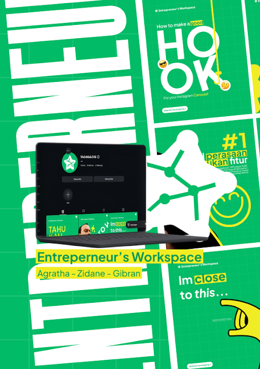
For the carousel, I made several slides with different layouts and content. I added elements like a laptop, a person illustration, emojis, big typography, lines, and simple shapes to make the slides more interesting. I also tried to make each slide look connected, so when the carousel is viewed from the beginning until the end, it still feels like one design.
I also added the names Agratha, Zidane, and Gibran as the creators of the project. I tried to keep the design clean and not put too many elements on each slide. Some parts have big text to make the main message easier to notice, while other parts use smaller text and illustrations to fill the space.
While making this carousel, I learned how to arrange text, images, colors, and shapes into one design. I also learned that making a carousel is not only about making one slide look good, but also making all the slides work together. I tried different positions and layouts until I got a result that looked good enough.
Overall, I made this carousel in a fairly simple style because I wanted to focus on the main idea and make it easy to understand. It was also a good opportunity for me to practice my graphic design, layout, typography, and creativity while working on a school project.